Choose a Hue That’s Right For You

The colours in your kitchen’s scheme are a personal, creative expression and the process of honing down the hues that work for your design will be enjoyable! The fantastic thing is there is actually no wrong or right here, it’s just about navigating the options with your Pluck designer – a tip from Pluck Co-founder George on where to find inspiration is below.
There’s no one rule to follow, minimalist neutrals create a calming sanctuary for some, whilst others may interpret them as bland. Bold colour will invigorate and uplift certain people, but overwhelm others. It really is incredibly subjective and the reality is most of us are probably somewhere in-between, in what we are drawn to and want to live with. Whatever the case, the scheme you chose for your kitchen is one you should derive pleasure from living with, here is some inspiration…


MIXING MASTERCLASS
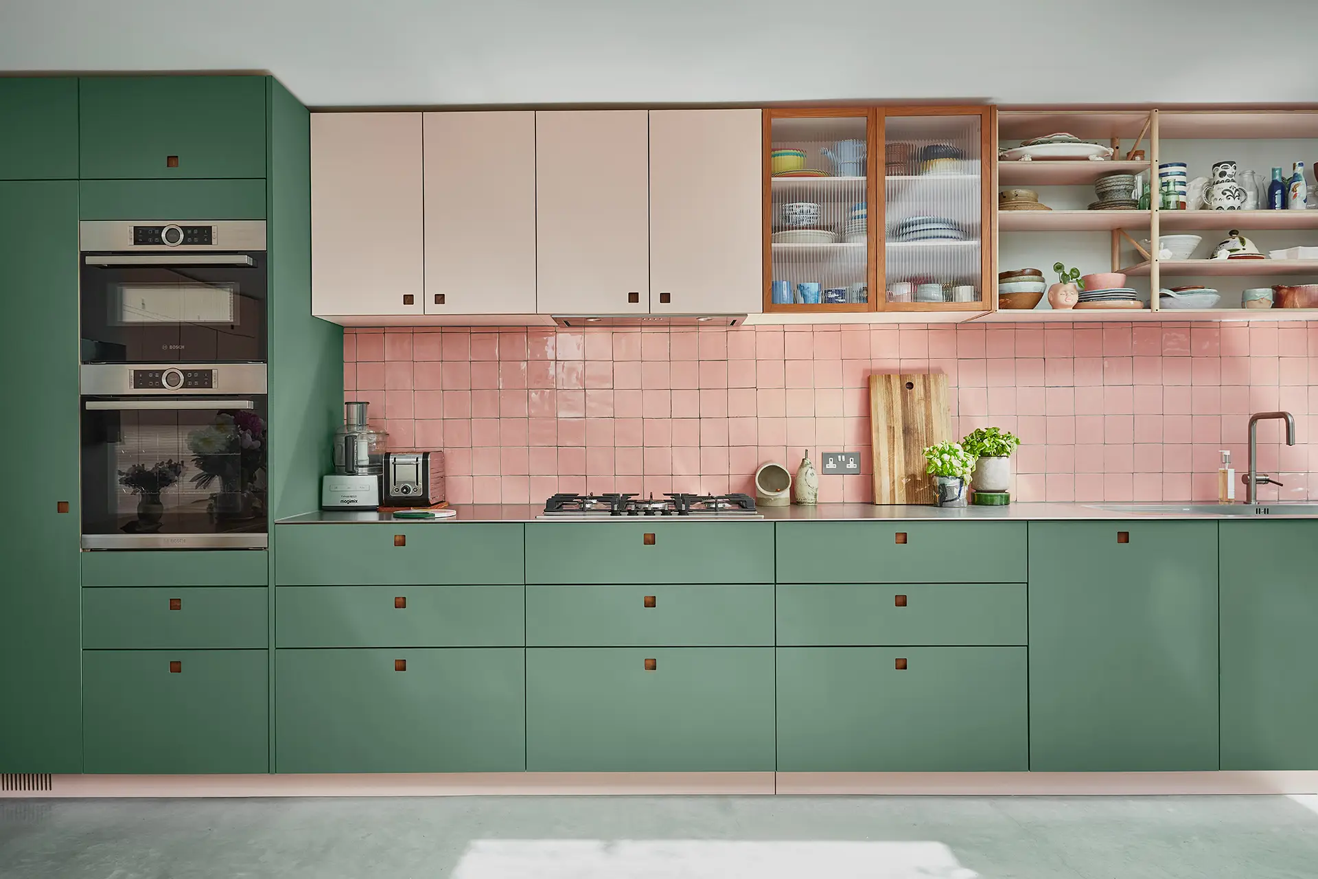
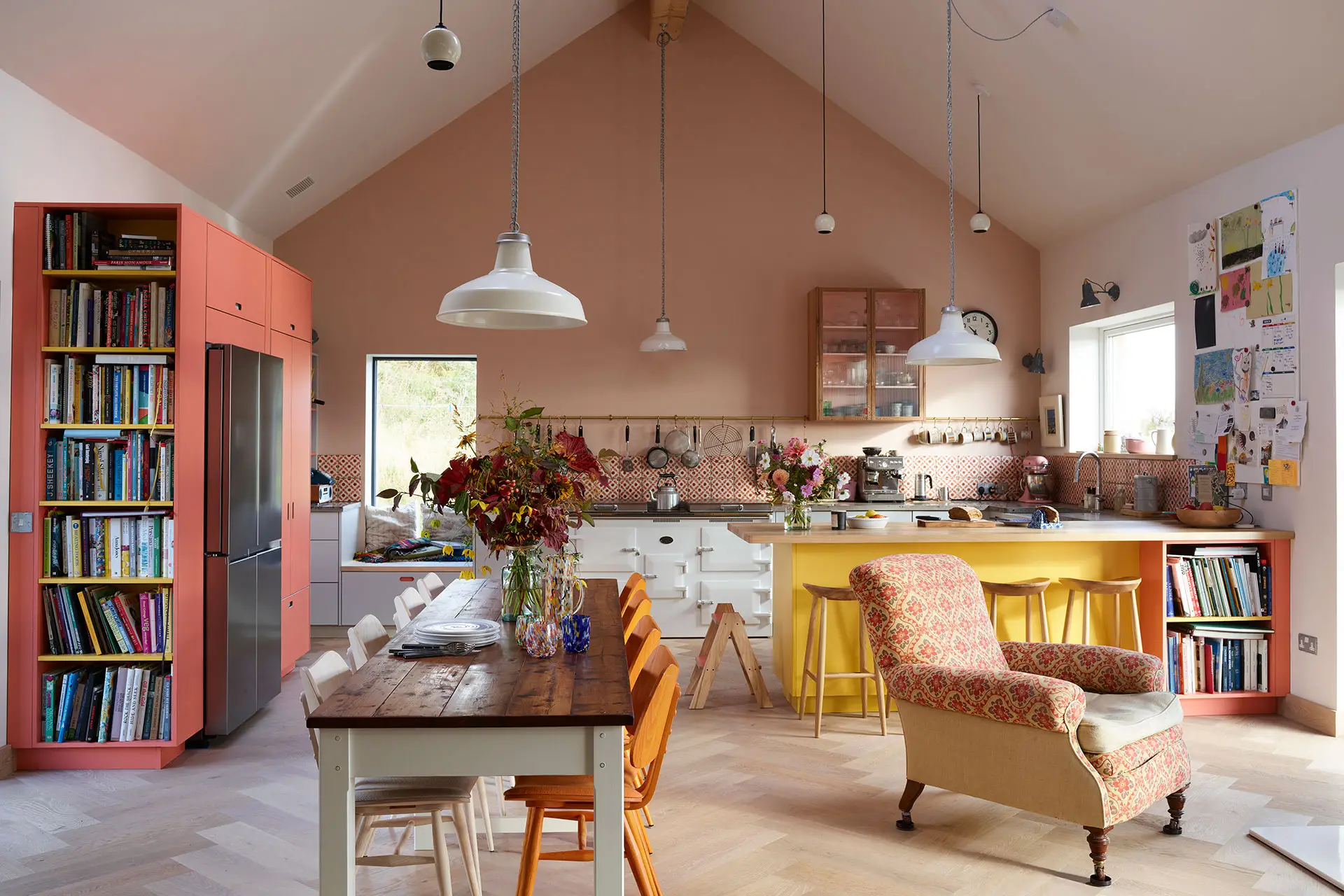
These kitchens include several Pluck colours. Their arrangement visually separates the cupboards and peninsulas, zoning spaces and also fostering a feeling of individual pieces of furniture or collections of cabinetry, rather than a homogeneous whole of one colour. Should you opt for a group of colours, our designers will cook up the mix!

TWO-TONE
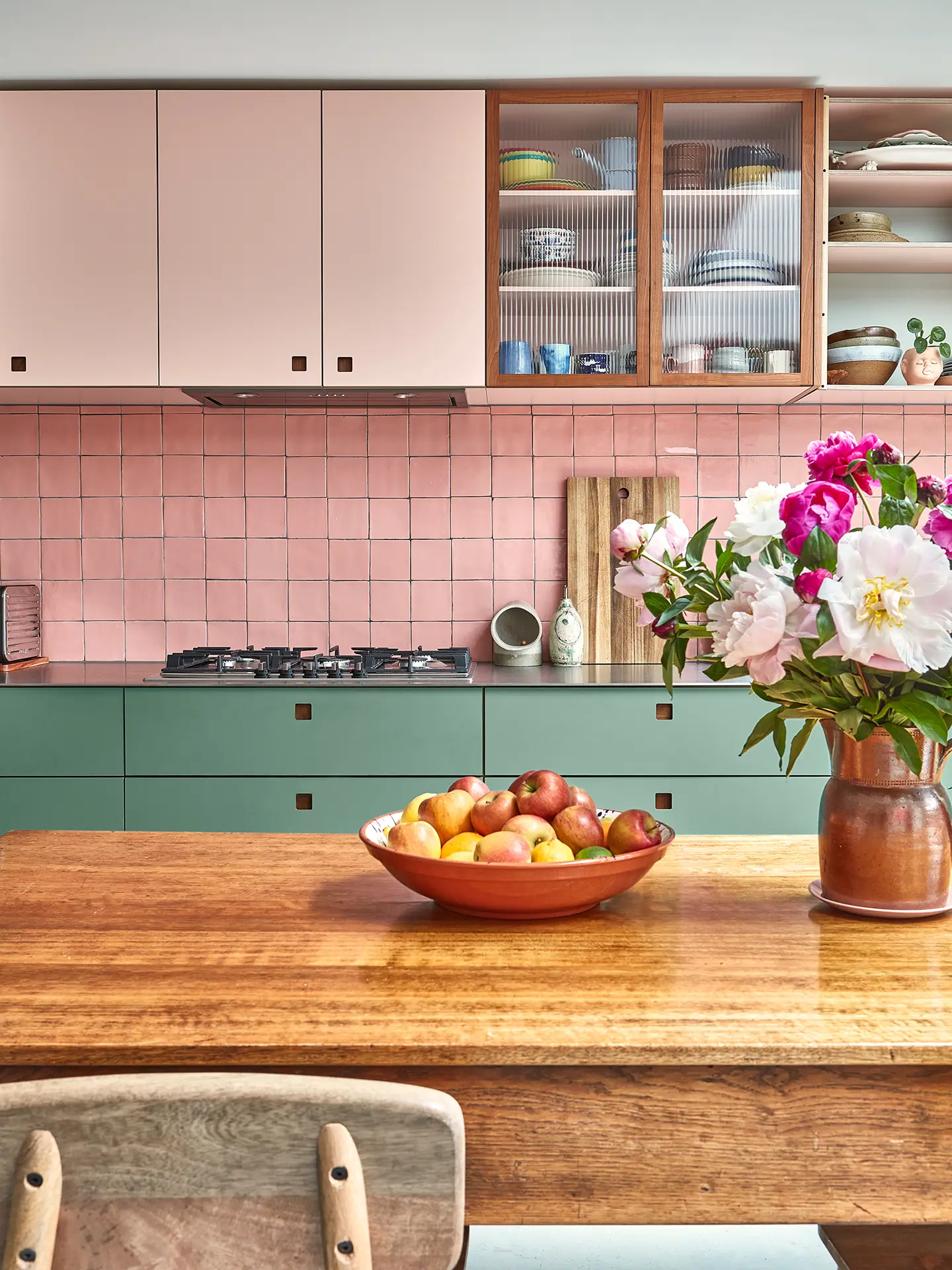
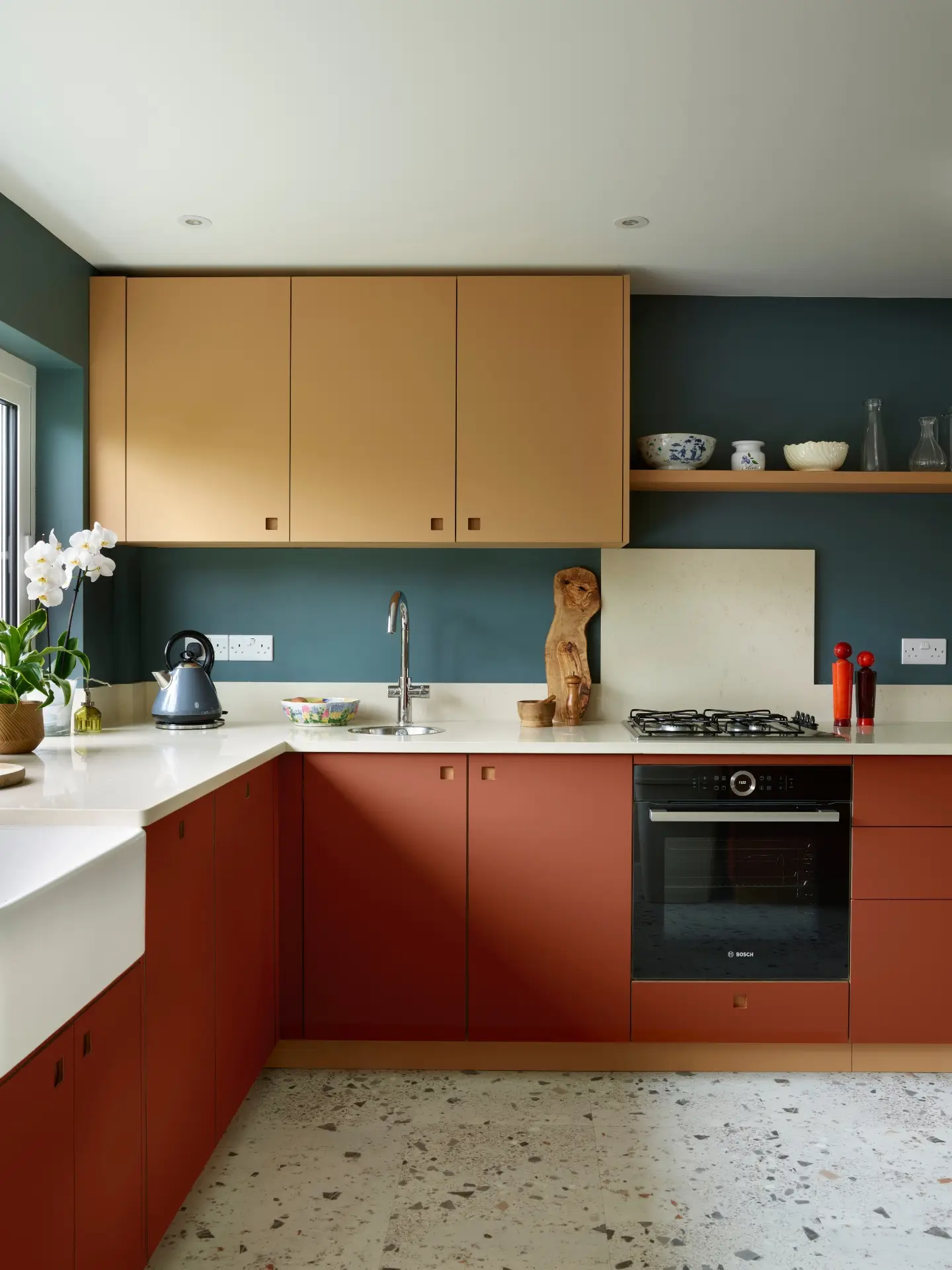
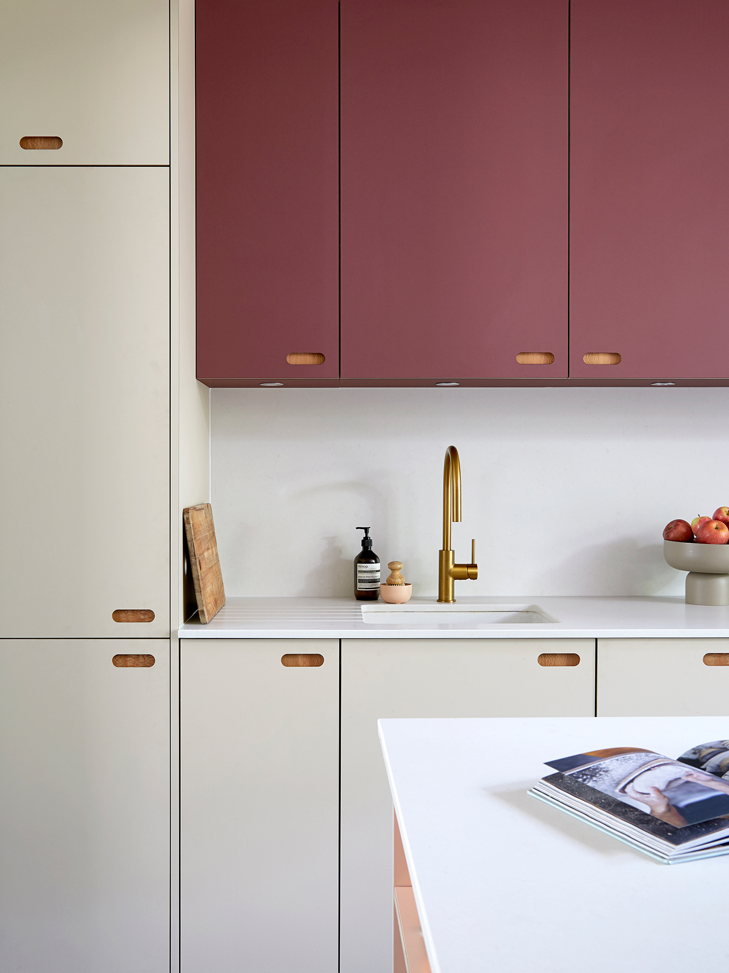
Contrasting and complementary or similar shades – opting for two colours from Pluck’s collections means the difference between the two hues and how they interact with each other is plain to see. This is particularly effective when wall cupboards sit above a run of cabinetry. Generally (but not always!), the darker hue sits below the lighter, giving weight and grounding the lower cupboards, which makes sense as they literally sit on the floor!
Our designers are here to help you with every aspect of your new kitchen including choosing a colour scheme – here’s a top tip from Pluck Co-Founder George:
“Gathering inspiration from other interiors you love is always a good start, whether you’ve visited the spaces in-person or discovered them online. Plus imagery of colour combinations you enjoy – paintings, fabric, your favourite jumper or anything that tickles your fancy!”


GO BOLD
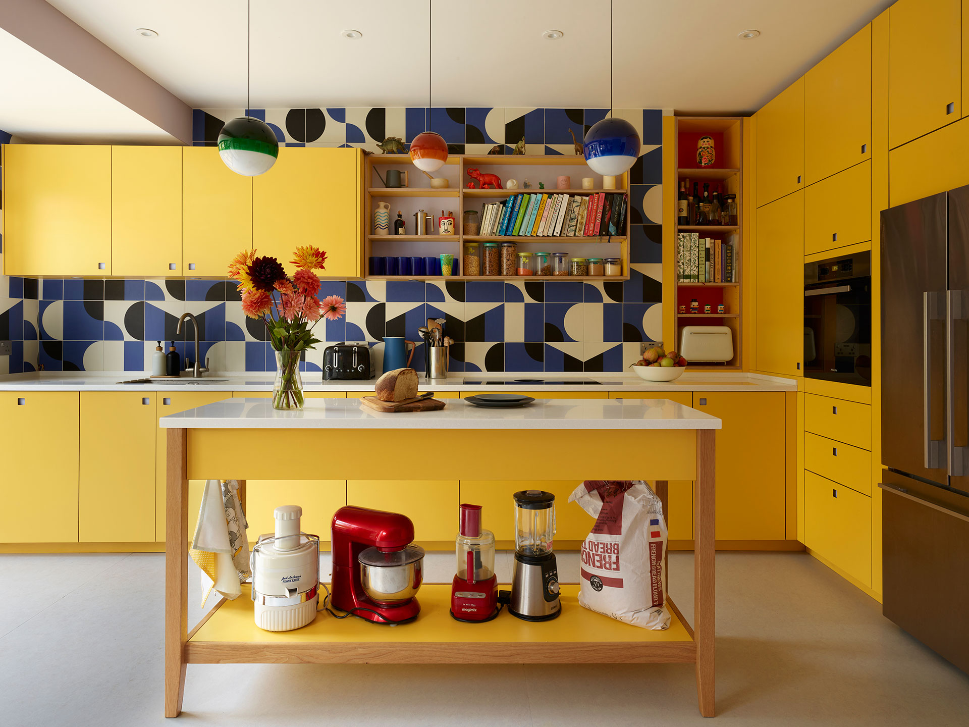
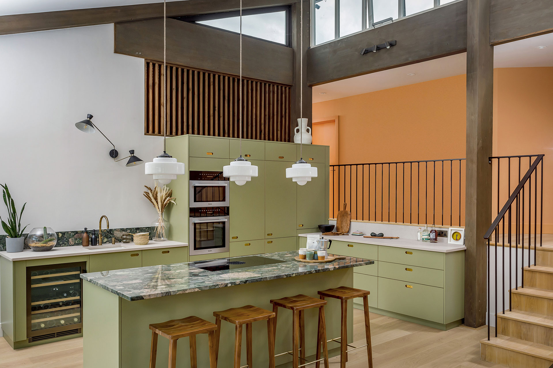
These kitchens are a great example of how committing to a single colour for cabinetry can pack a punch. The impact of the colour is visceral and it unashamedly dominates; it is wonderful to see a personal passion for a particular hue embraced.

NEUTRALS
There are many ways to express a seemingly simple neutral palette in a kitchen, shades of white, barleys, cashmeres, linen, beiges with a little wood to add warmth. Without a doubt these kitchens have a serenity and sophistication to them by virtue of the absence of colour. Wood brings warmth and texture too.
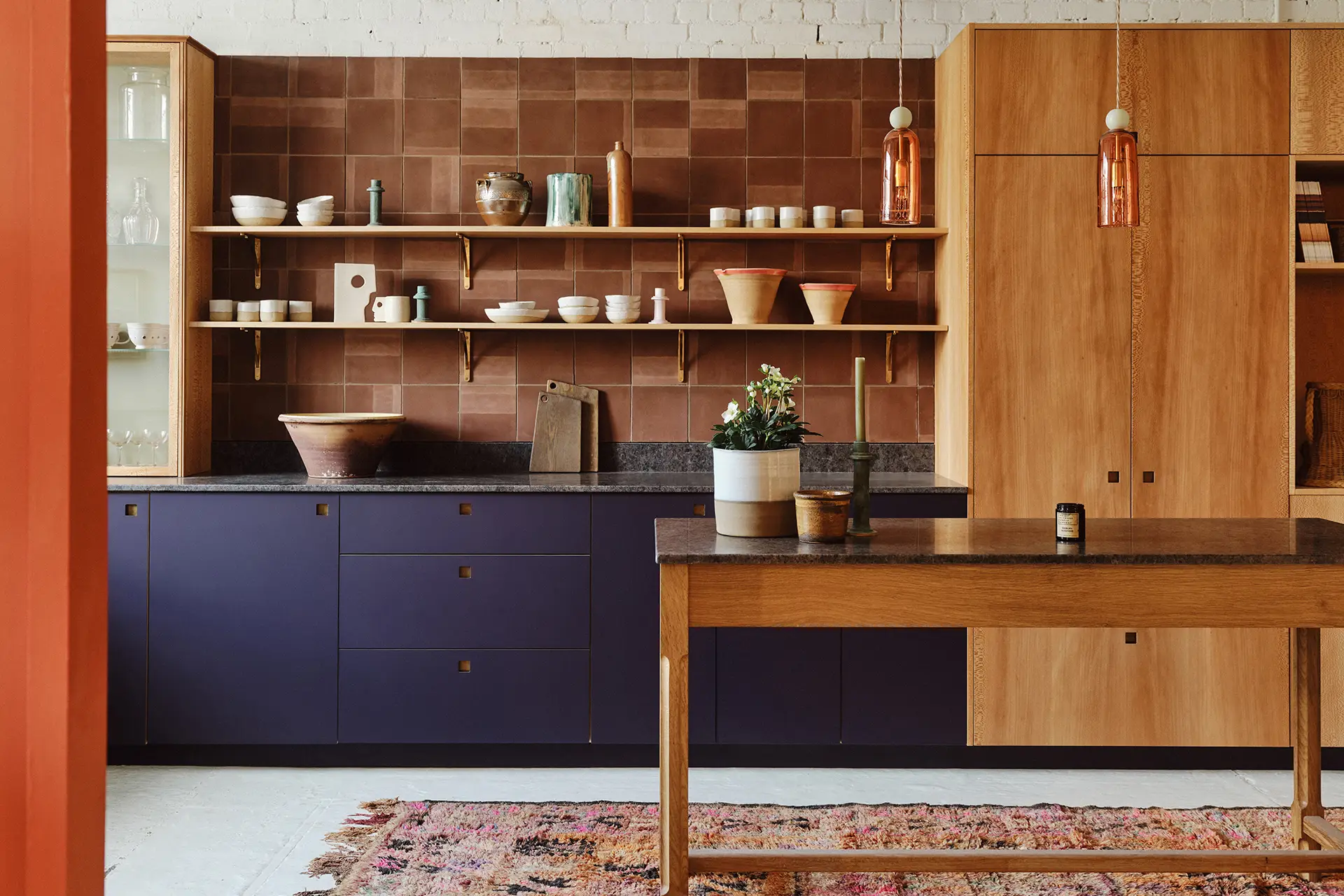


WOOD AND COLOUR
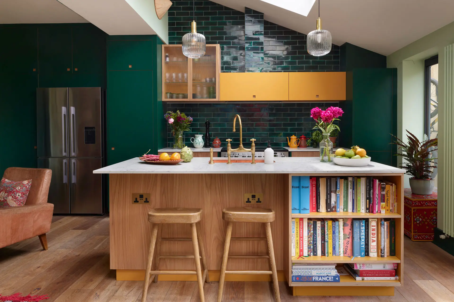
Of course wood is about more than just one colour BUT when combined with your preferred hue the results are delicious…

…AND FINALLY, COLOURFUL WOOD
This kitchen includes coloured wood from our recent collaboration with German timber specialists Schotten & Hansen, along with Elm and Terracotta cupboards with a Turnmill Prep Table in London Plane wood.
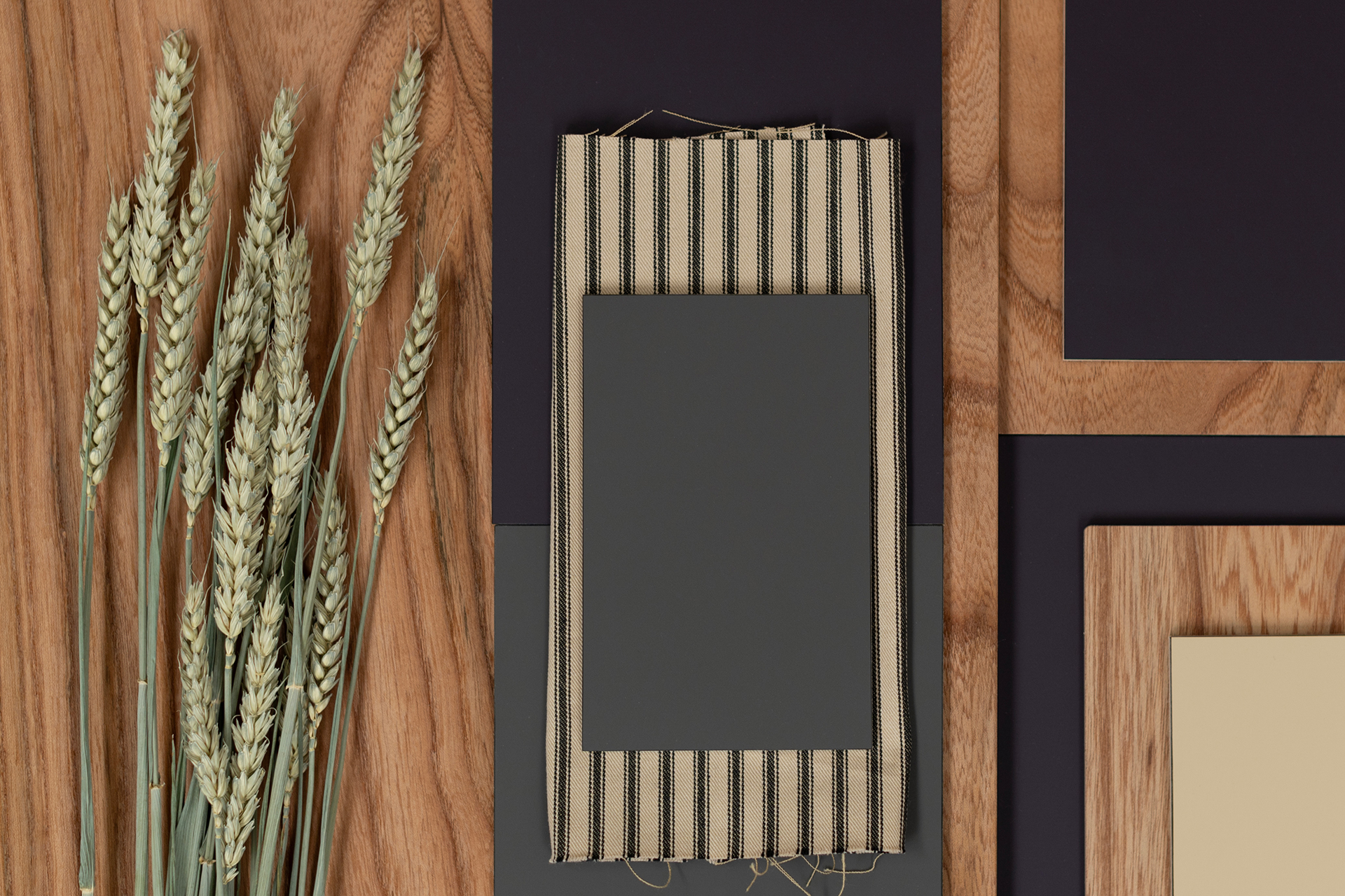
Looking for more inspiration? Alongside delectable combinations of our woods and colours, the Pluck palettes include worktops, fabrics and tiles, plus a little flourish to celebrate nature’s beauty.


MIXING MASTERCLASS
These kitchens include several Pluck colours. Their arrangement visually separates the cupboards and peninsulas, zoning spaces and also fostering a feeling of individual pieces of furniture or collections of cabinetry, rather than a homogeneous whole of one colour. Should you opt for a group of colours, our designers will cook up the mix!
TWO-TONE
Contrasting and complementary or similar shades – opting for two colours from Pluck’s collections means the difference between the two hues and how they interact with each other is plain to see. This is particularly effective when wall cupboards sit above a run of cabinetry. Generally (but not always!), the darker hue sits below the lighter, giving weight and grounding the lower cupboards, which makes sense as they literally sit on the floor!
Our designers are here to help you with every aspect of your new kitchen including choosing a colour scheme – here’s a top tip from Pluck Co-Founder George:
“Gathering inspiration from other interiors you love is always a good start, whether you’ve visited the spaces in-person or discovered them online. Plus imagery of colour combinations you enjoy – paintings, fabric, your favourite jumper or anything that tickles your fancy!”
GO BOLD
These kitchens are a great example of how committing to a single colour for cabinetry can pack a punch. The impact of the colour is visceral and it unashamedly dominates; it is wonderful to see a personal passion for a particular hue embraced.

NEUTRALS
There are many ways to express a seemingly simple neutral palette in a kitchen, shades of white, barleys, cashmeres, linen, beiges with a little wood to add warmth. Without a doubt these kitchens have a serenity and sophistication to them by virtue of the absence of colour. Wood brings warmth and texture too.
WOOD AND COLOUR
Of course wood is about more than just one colour BUT when combined with your preferred hue the results are delicious…
…AND FINALLY, COLOURFUL WOOD
This kitchen includes coloured wood from our recent collaboration with German timber specialists Schotten & Hansen, along with Elm and Terracotta cupboards with a Turnmill Prep Table in London Plane wood.
Looking for more inspiration? Alongside delectable combinations of our woods and colours, the Pluck palettes include worktops, fabrics and tiles, plus a little flourish to celebrate nature’s beauty.