


The Yellow Galley Kitchen in Herne Hill
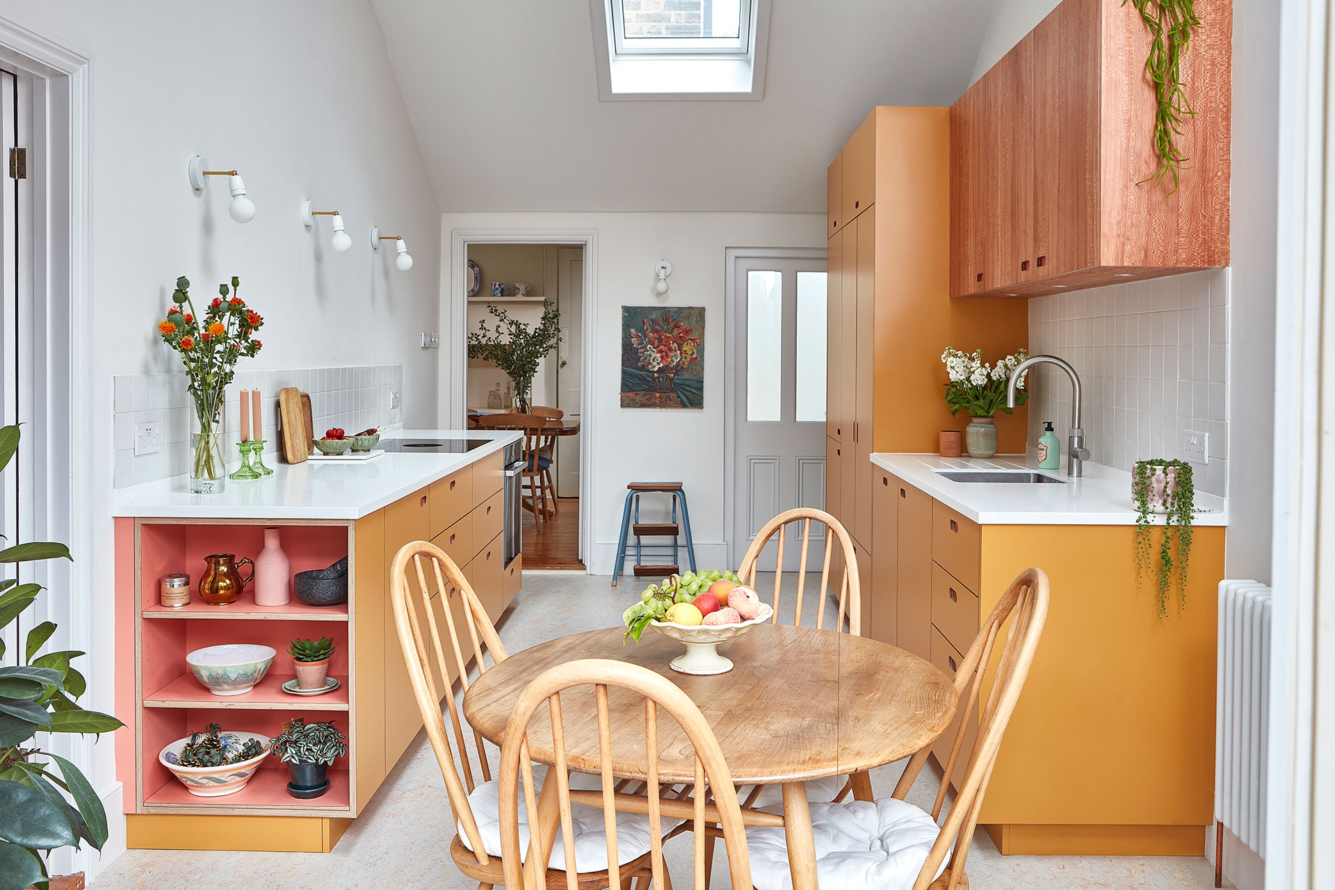
The first impression of this kitchen is the cabinetry’s colour, Pluck’s Market Mustard, a rich, dark yellow that gives a positive glow to the space. There are flashes of Ritzy too, coral pink pops in the larder, shelf interior and recessed handle backs; and this embracement of colour was a very conscious decision by our clients, who said their kitchen ‘needed to be fresher’ as they replaced their 30 year old, cream, Shaker units, which having served them well, were now falling apart.
Having lived in their Edwardian house for decades, they were absolutely familiar with how the space was used and described the kitchen as ‘a bit of a thoroughfare’ with doors at both ends. With this in mind we worked to redesign the layout. The old kitchen included a peninsula, but we switched to a galley style, leaving the floor as open as possible, whilst designing storage that meant precious cupboard space was not lost.
We kept one side of the kitchen entirely free of wall cabinetry which, along with the high ceilings, keeps it feeling open and ensures the view between the dining room and garden is unobstructed. The wall lights from Spark & Bell are pleasingly placed and give a simple and practical look.
A larder was top of the list, so we worked to incorporate this with taller cabinetry on the other side of the galley; this was a good place to put a mini-run of shallow wall cabinets, meaning the worktop space below was not overhung. We used London Plane here to bring texture with its gorgeous grain.
Vintage oil paintings are from our shop and the Ercol dining table and chairs were purchased many years ago from Morbleu. The floor is Marmoleum’s Fruit Punch from Lordship Flooring.
Speaking to Kitchen, Bedroom & Bathroom magazine about the renovations the homeowners said ‘I like to sit at my table where I can see the garden on one side and my lovely kitchen on the other. We’re so, so pleased with the result’.
Photographer: Malcolm Menzies